The pairplot() function is a type of distribution plot that can basically plot a joint plot for all the possible numerical combinations and boolean columns in our datasets.
Basically, you can plot multiple pairwise bivariate distributions in a dataset.
This function allows us to create an axis grid through which numerical variable is stored in data that can be shared across the x and y-axis in the structure of columns and rows.
We can also create a scatter plot if we want to display the pairwise relationships with a distribution plot displaying the data distribution in the column diagonally.
Syntax:
sns.pairplot(data, hue = None,  hue_order = None, palette = None, vars = None,
x_vars = None, y_vars = None, kind = 'scatter',  diag_kind = 'auto', markers = None,
height = 2.5, aspect = 1, corner = False, dropna = False,  plot_kws = None,
diag_kws = None, grid_kws = None,  size = None  )
Parameters:
- data: It accepts the data depending on the visualization to be plotted.
- hue: It is variable in
datato map plot aspects to different colors. - hue_order: It is a list or string which is the order parameter of the hue variable in the palette.
- palette: It is used to set the color of the hue.
- dropna: It can drop missing values from the data before plotting.
Example
import seaborn as sns
import matplotlib.pyplot as plt
import pandas as pd
df = sns.load_dataset('taxis')
# pairplot with hue payment
sns.pairplot(df, hue ='payment')
# to show
plt.show()
Output:
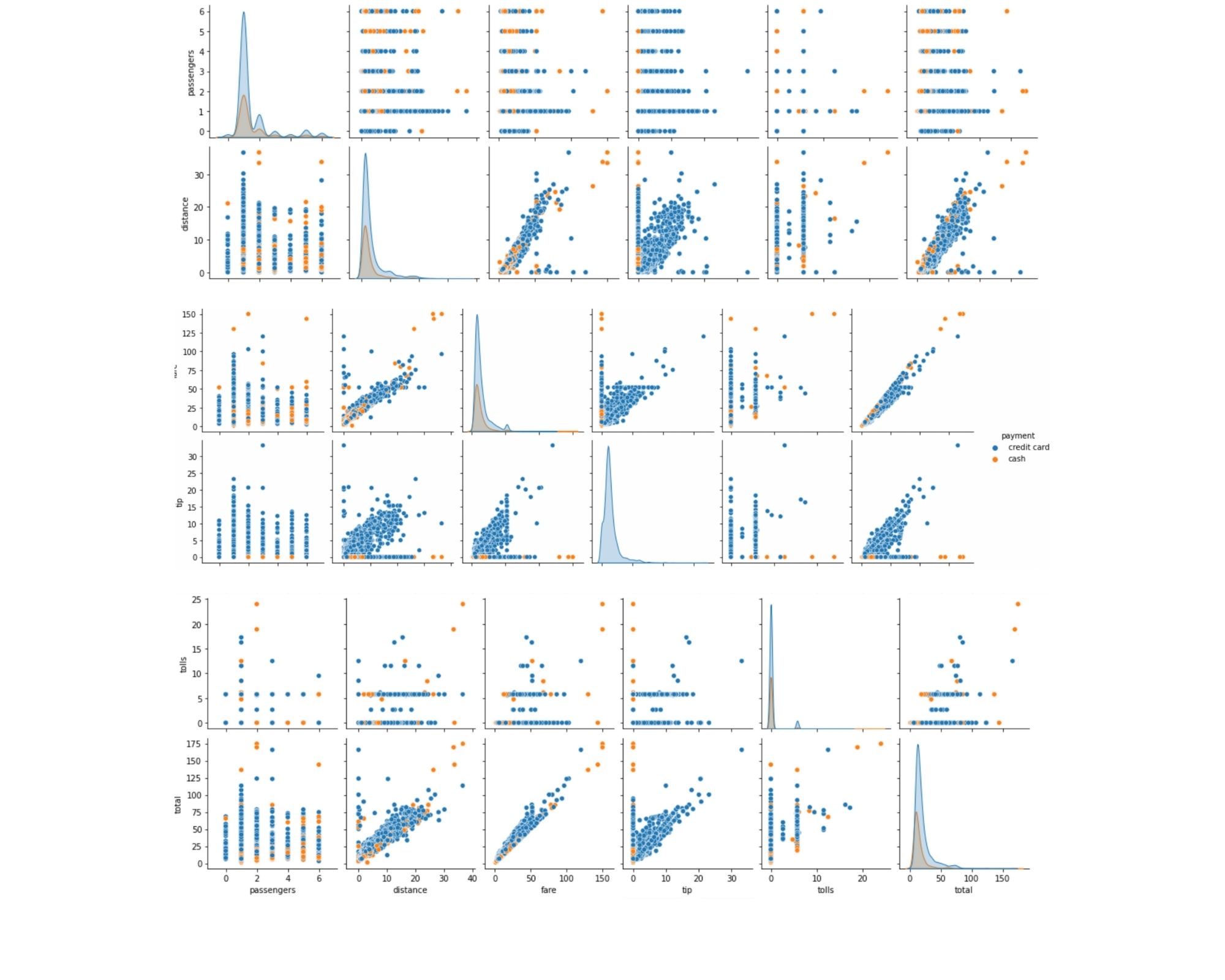
In the above example, firstly we have imported the required library and then loaded the data set of taxis to work with. Then we will use pairplot() function to visualize the plot with the hue parameter and set its value to payment. In the last we have used matplotlib show() function to display the plot to the users.
- Log in to post comments