ECDF Stands for Empirical Cumulative Distribution Function. ECDF Plot represents the proportion or count of observations falling below each unique value in a dataset.
As compared to histogram or KDE Plot it is more advantageous because in this visualization of each and every data point of the dataset directly, which makes it easy for the user to interact with the plot.
This means that there is no smoothing or bin size parameter which make ECDF Plot more informative. As this curve is monotonically increasing, therefore it is well suited for comparing multiple distributions at the same time.
In ECDF Plot basically, the x-axis correlates to the range of values for variables whereas the y-axis correlates to the proportion of data points that are less than or equal to the corresponding value of the x-axis.
Syntax
seaborn.ecdfplot(data=None, *, x=None, y=None, hue=None, weights=None,
stat='proportion', complementary=False, palette=None, hue_order=None,
hue_norm=None, log_scale=None, legend=True, ax=None, **kwargs)
Parameters:
- x,y: Data or column name for which plot is made.
- data: Input dataset or data structure.
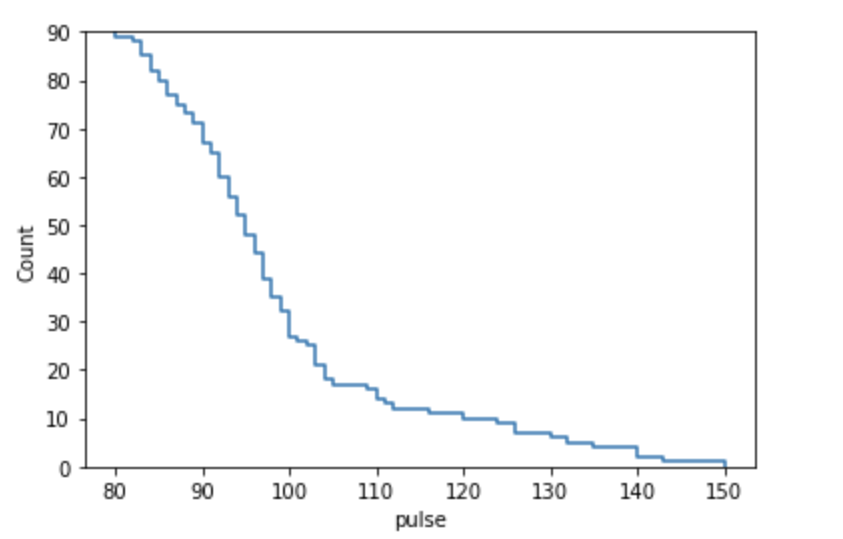
- complementary: It is a boolean value. If True, it uses the complementary CDF.
- stat: proportion or count. It is used as a distribution statistic to compute.
Examples
import seaborn as sns
import pandas as pd
from matplotlib import pyplot as plt

#load datasets
data=sns.load_dataset('exercise')
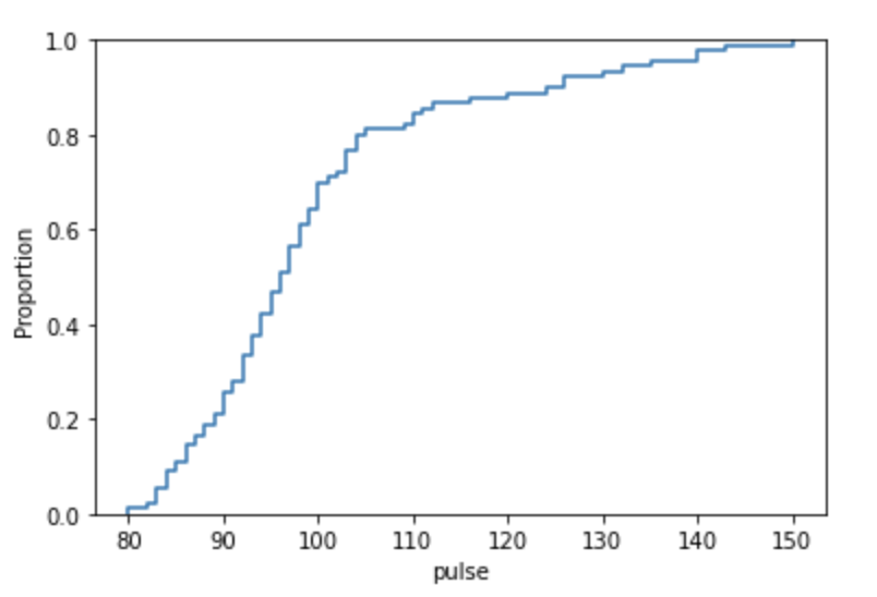
Creating a simple ECDF Plot
sns.ecdfplot(x='pulse', data=data)Output:
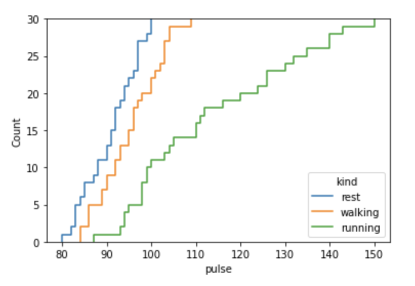
Using stat:count:
sns.ecdfplot(data=data,x='pulse',hue='kind',stat='count')Output:
Using complementary
sns.ecdfplot(x='pulse', data=data, stat='count', complementary=True)Output:
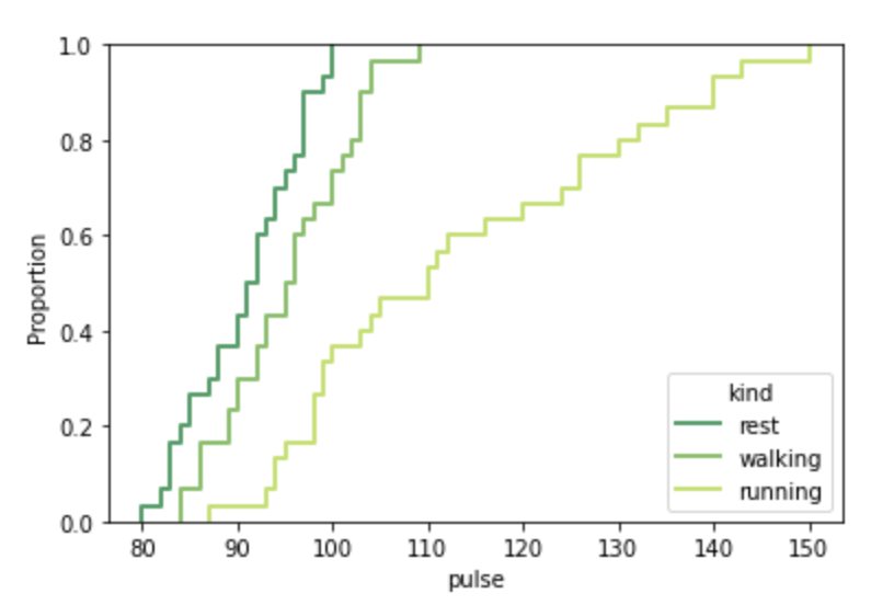
Styling of the ECDF Plot
sns.ecdfplot(data=data,x='pulse',hue='kind',palette='summer', lw=2)Output:
- Log in to post comments