A bar plot is a graph that represents a category of data with rectangular bars with heights that are used to indicate values. The bar plots can be plotted horizontally or vertically.
It also represents an estimate of the central tendency of a numerical value with respect to the height of the rectangular bar and also provides some uncertainty around that estimate using error bars.
It also displays the mean value for each value in a categorical column, against a numeric column. The first parameter is the categorical column, the second parameter is the numeric column and the third parameter is the dataset.
Syntax
seaborn.barplot(*, x=None, y=None, hue=None, data=None, order=None, hue_order=None,
estimator=<function mean at 0x7ff320f315e0>, ci=95, n_boot=1000, units=None, seed=None,
orient=None, color=None, palette=None, saturation=0.75, errcolor='.26', errwidth=None,
capsize=None, dodge=True, ax=None, **kwargs)
Parameters:
- x,y: It takes inputs for plotting long-form data.
- data: It is dataset for plotting.
- ci: It is the size of confidence intervals to draw around estimated values.
- units: It is the identifier of sampling units, which is used to perform a multilevel bootstrap.
Examples
import pandas as pd
import numpy as np
import matplotlib.pyplot as plt
import seaborn as sns
data=sns.load_dataset('taxis')
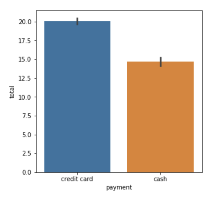
#creating simple bar plot
plt.figure(figsize=(5,5))
sns.barplot(y='total',x='payment',data=data)
Output:
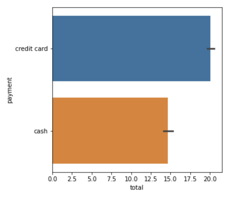
#horizontal bar plot
plt.figure(figsize=(5,5))
sns.barplot(x='total',y='payment',data=data)
Output:
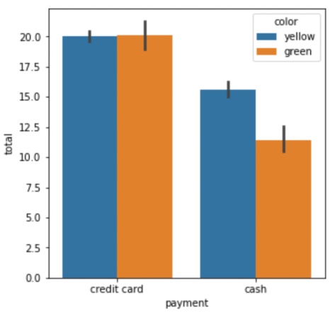
#using hue
plt.figure(figsize=(5,5))
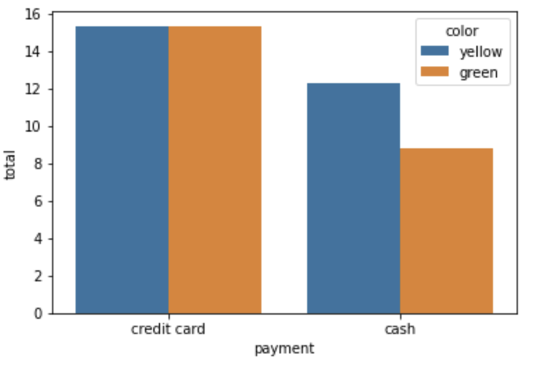
sns.barplot(y='total',x='payment',hue='color',data=data)Output:
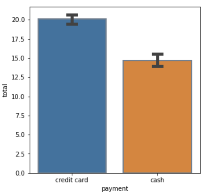
plt.figure(figsize=(5,5))
sns.barplot(x='payment', y='total', data=data,errwidth=5, capsize=0.1, ci=99.5, edgecolor='slategray', linewidth=2)
Output:
sns.barplot(x='payment',y='total',hue='color',data=data,estimator = np.median,ci =0)Output:
- Log in to post comments